


Brand Library
College Logo
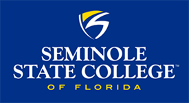
A modernized version of a shield, the Seminole State logo symbolizes tradition, but is also progressive, strong and forward-thinking. SSC Dark Blue and SSC Bright Gold have been the College's brand colors since it was founded in 1965.
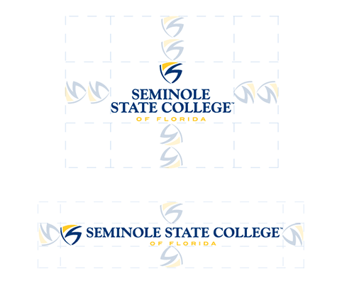
The primary logo consists of the logomark stacked on top of the logotype and should be used as a first option. In cases where the primary logo doesn’t fit with design or space considerations, the secondary logo is permissible.
Please do not use AI tools to create graphics featuring the College's logo, as it may distort or unintentionally alter the logo's appearance.
The logomark cannot exist independent of the logotype.
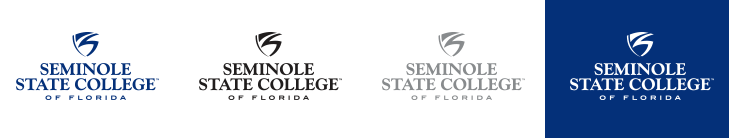
The two-color version of the logo is displayed in SSC Dark Blue and SSC Bright Gold (shown below). View color breakdown on the Colors and Fonts page.
When displayed on a dark background, the reversed two-color version of the logo should be used in SSC Bright Gold and white.
Two-Color Version
Reversed Two-Color Version
One-Color Version
A one-color version of the logo can also be used but only in SSC Dark Blue, black, gray (50% black) or white.
The minimum clear space around the logo is the designated amount of space that is to be left empty. This allows for the logo to stand on its own and not compete with other surrounding elements such as type or graphics. We use the height of the logomark in order to measure the amount of clear space that we want to leave. For the primary logo, leave the height of two logomarks. Only one is needed for the secondary logo.
- Do not change the proportions of the logo (stretch or squish).
- Do not enlarge the logo beyond 100% resulting in it looking blurry or fuzzy.
- Do not edit or separate individual elements.
- Do not change the colors.
- Do not apply layer effects such as beveling or drop shadows.
- Do not place the logo on background with poor contrast or texture/pattern.
For the logo to retain its legibility, there is a minimum size that it can be displayed.
The minimum size for the primary logo is 2 inches.
The minimum size for the secondary is 1.025 inches.


College Seal
The college seal serves as a modern emblem reflecting Seminole State’s history and values. Encircled by our college name and shield icon, the seal features an orange tree and soaring Raider bird to symbolize our rise from orange grove to alma mater and enduring pride, while palm trees and water reflect our Florida home and campus locations. A rendering of the E. Ann McGee Student Center below our founding year affirms our foremost priority – student success. Created in 2025, our 60th anniversary, the seal complements our visual identity and will strengthen brand recognition on diplomas, official documents and at ceremonial events.
Use of the college seal is strictly reserved for the Office of the President.